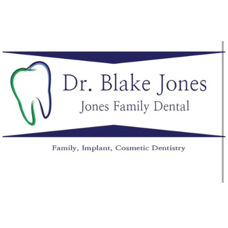
The Before.
We started with the original logo the founder developed fresh out of college. It had served its purpose, but no longer reflected the quality of their work or the expansion of the business.
Logo Lab
A Custom Brand.
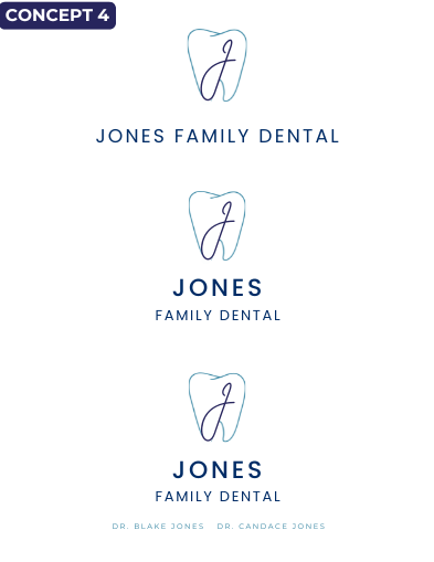
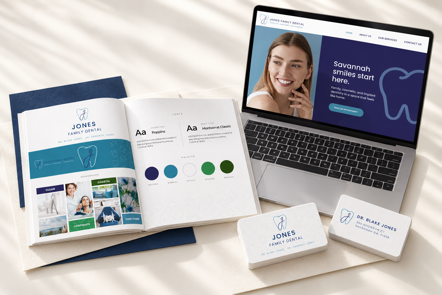
We wanted a custom design that showcased the family name: Jones. We iterated several times to find the right design, combining the J with their signature tooth icon.
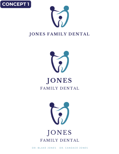
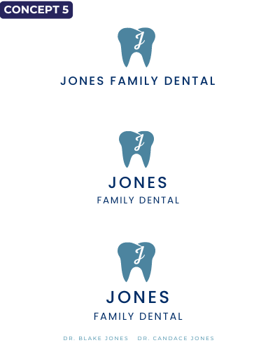
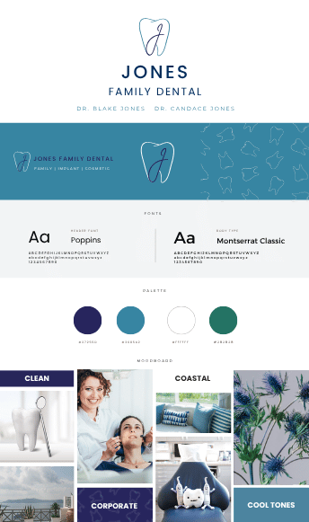
Full Brand Identity.
We took inspiration from the original blue and built out their color palette and logo stack.
A sister brand
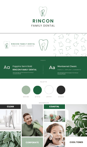
Meet Rincon Family Dental.
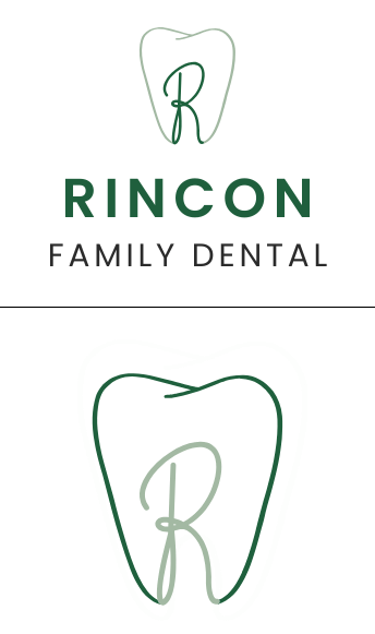
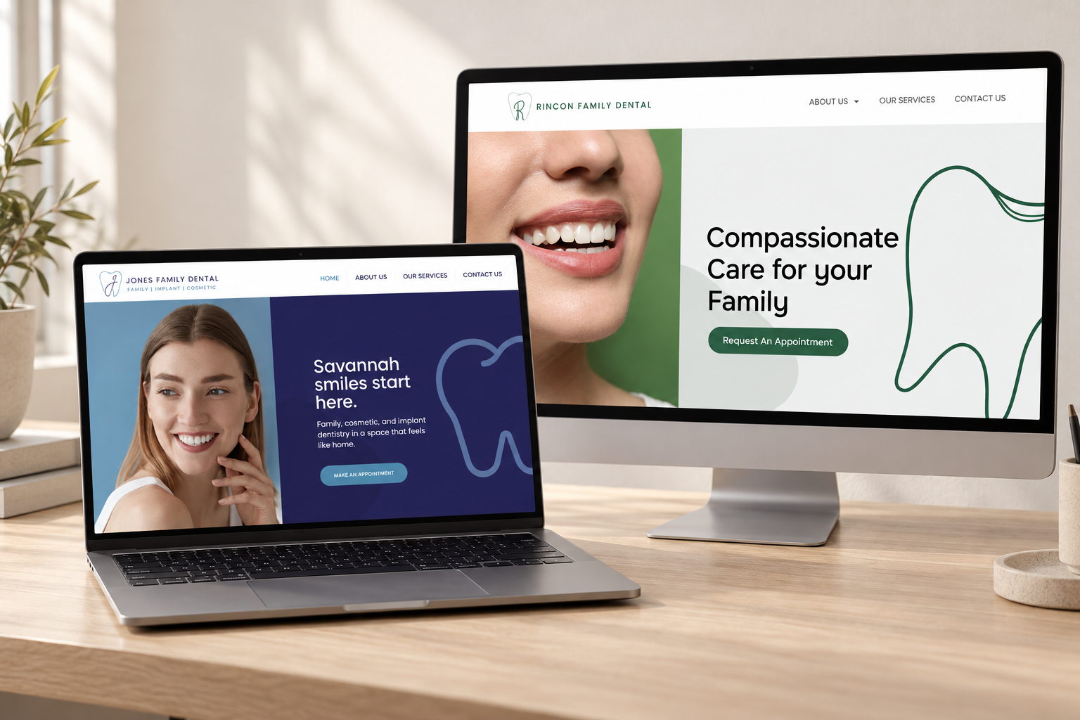
Next, we developed the identity for their sister location. The R monogram and green palette give Rincon its own presence while keeping the family resemblance unmistakable.
In their hands
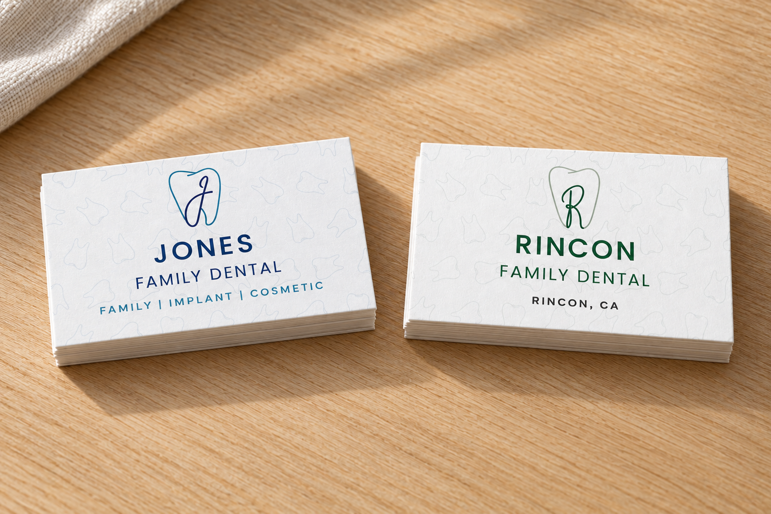
The details leave the screen.
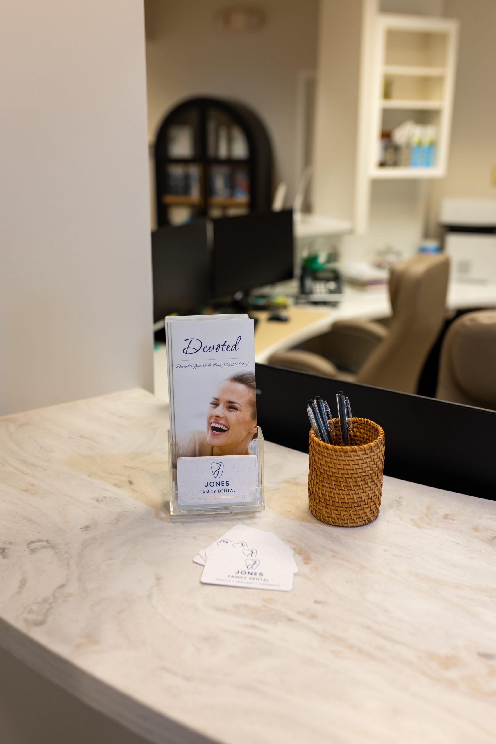
Business cards and appointment cards bring the new identity into everyday patient interactions. Jones and Rincon each have coordinated materials that belong to the same brand family.
People + place
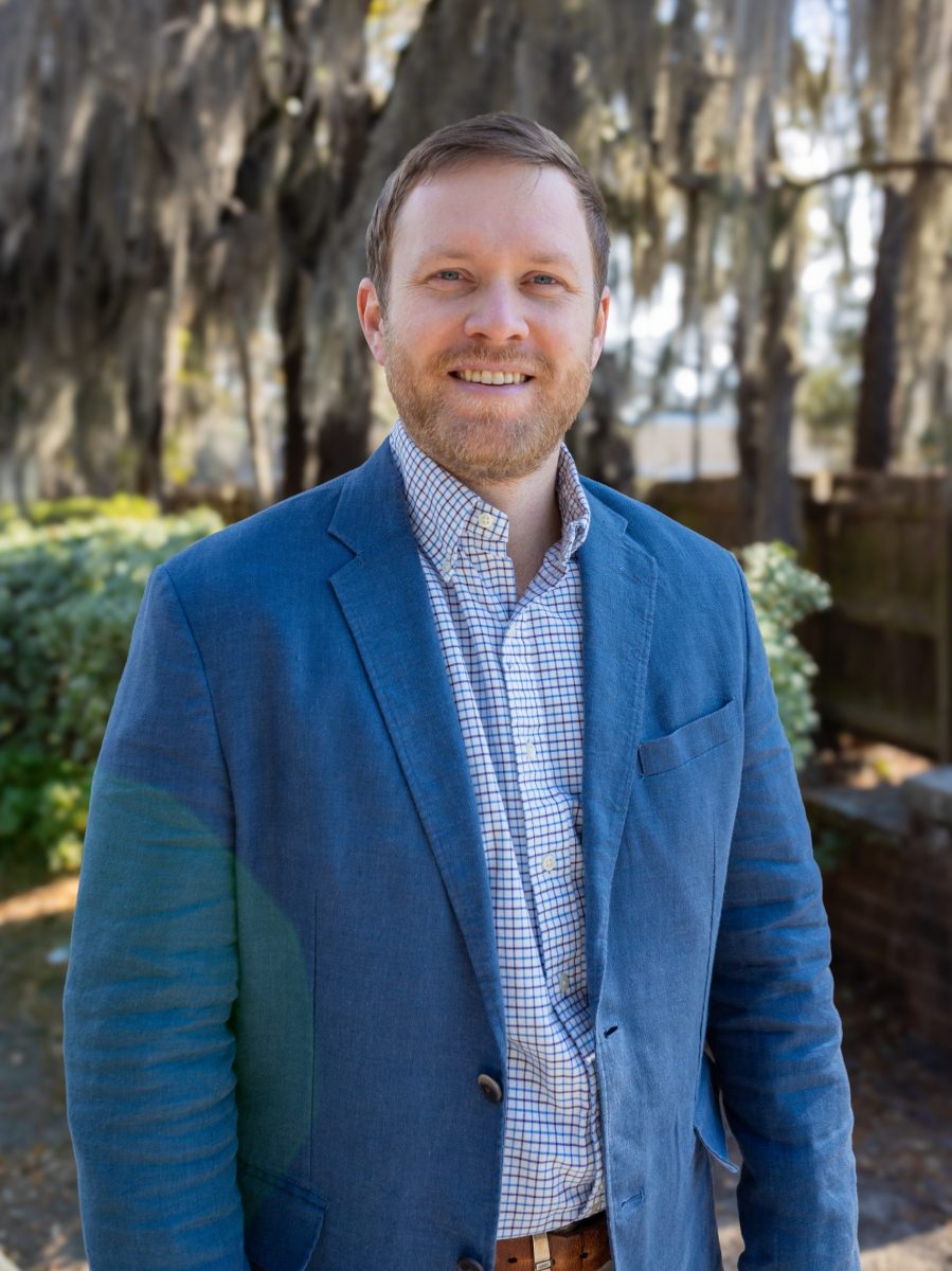
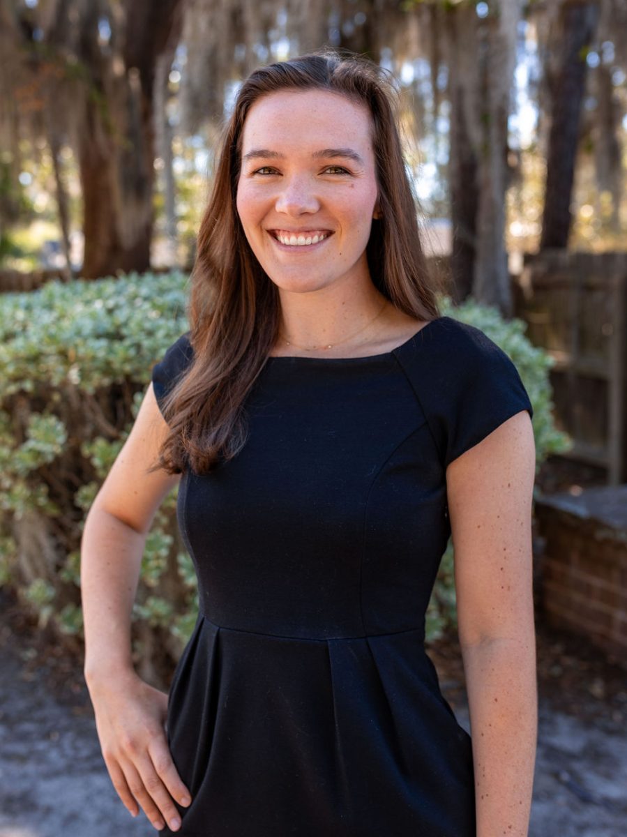
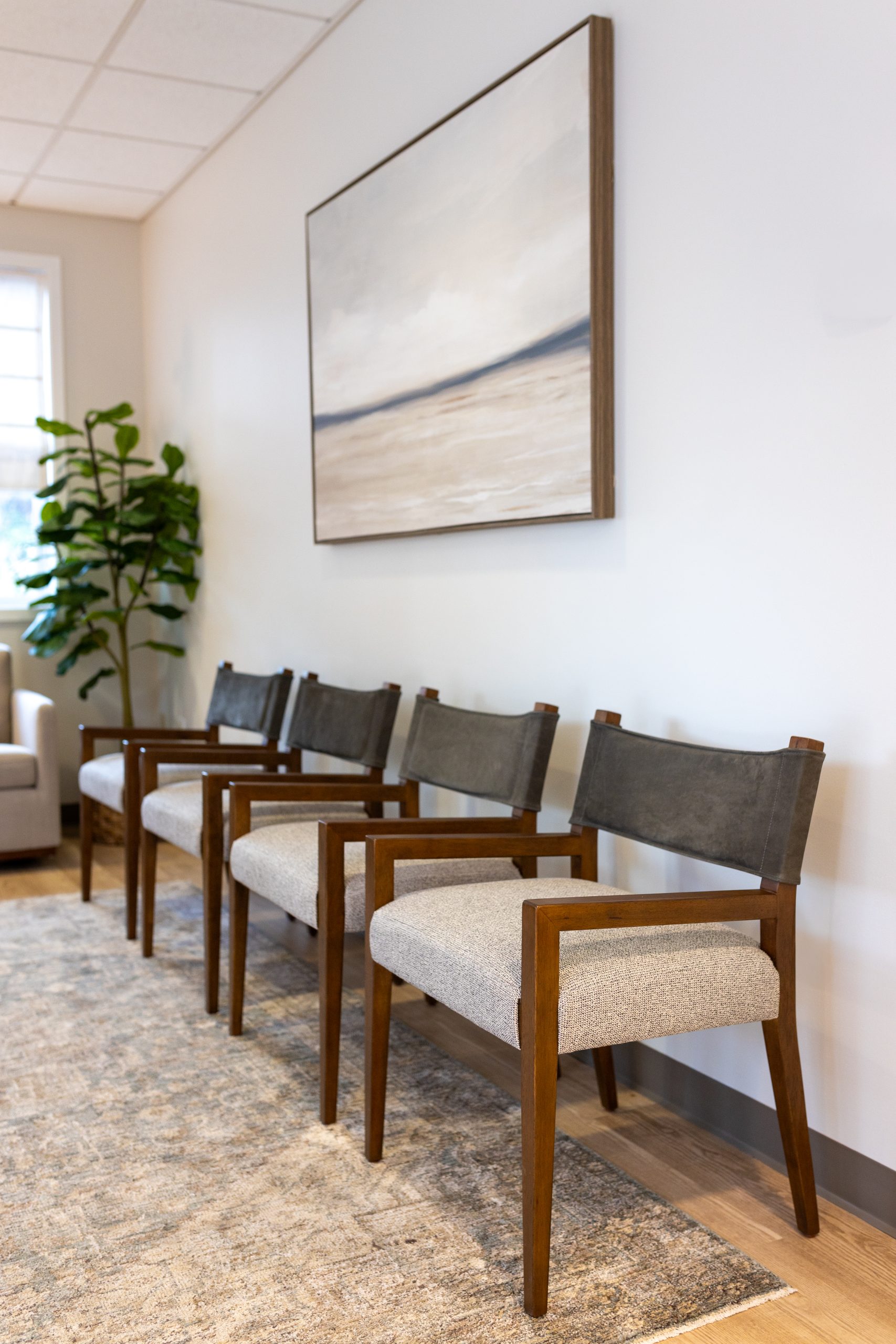
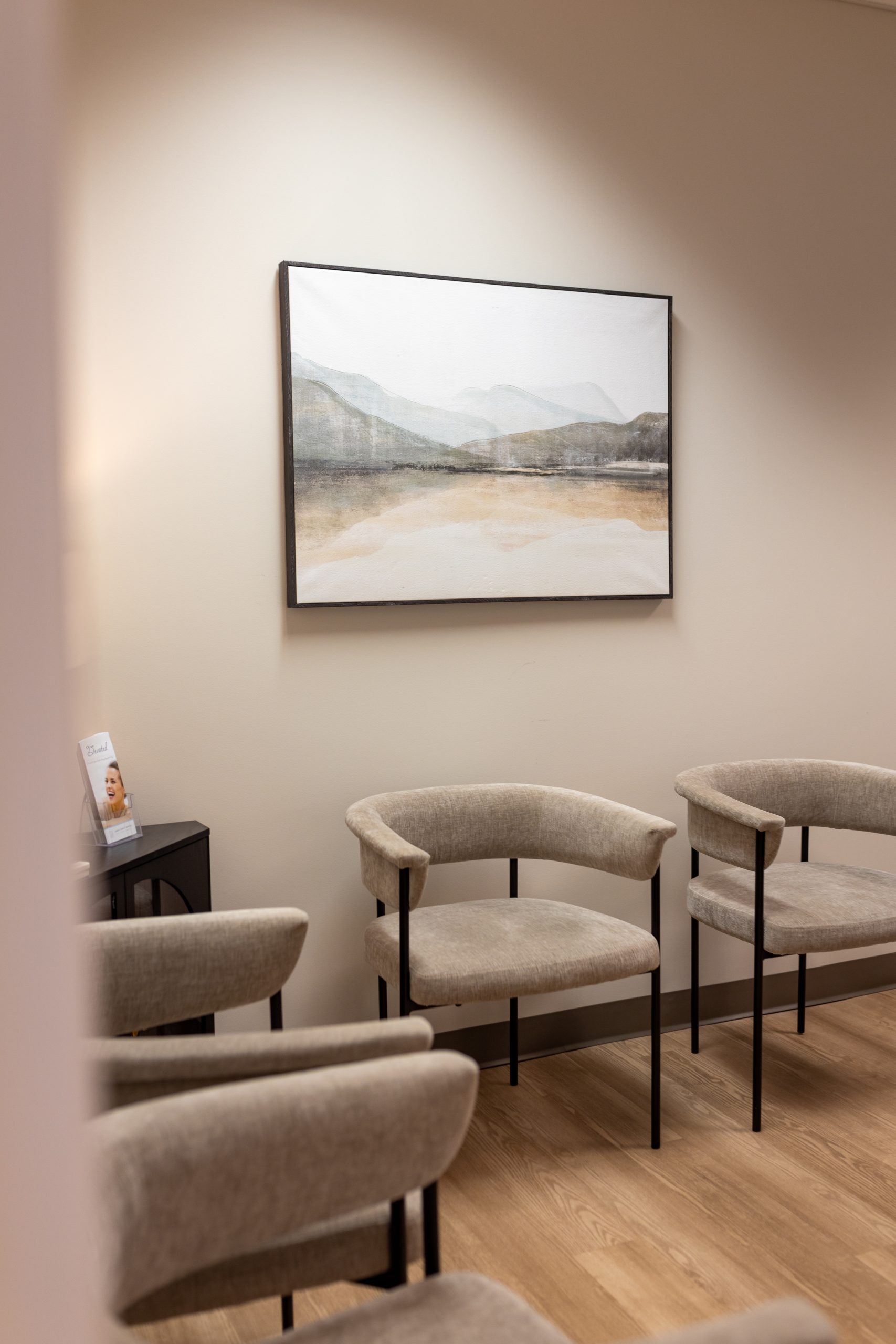
Real faces. A real place.
New staff headshots and facility photography show the people and space behind the practice. Original imagery carries the same care and consistency as the new branding.

Out in the world
A fresh start, inside and out.
From the custom logo to a sister location, website, printed materials, photography, and new building signage—the work comes together as one cohesive upgrade.
The final piece: building signage.
On-location photos of the new signs are coming soon.
New Websites
An Online Presence.
We brought both brands online with websites that showcase their people, services, and identity—Jones Family Dental in blue, and Rincon Family Dental in green.
Your next step
If your business has outgrown its brand, this is the right next step.
Start with a 30-minute conversation about the business you run today and the one your customers see online.
Savannah, GA · Every project led by Liesl Webber